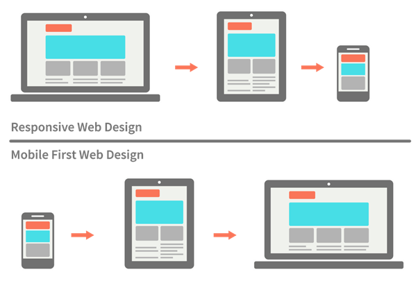
Responsive emails are an invaluable tool for businesses looking to stay ahead of their competitors. By using responsive emails, businesses can ensure their communications will be seen on any device, no matter the size. Responsive emails ensure clients have the best user experience when interacting with your emails. With the rise of mobile users, creating a responsive email is critical to ensure your emails look great on any device. This helps businesses implement an omnichannel approach by reaching more people, in more places, faster than ever before.
Responsive emails also make it easier for businesses to track the performance of their B2B content marketing campaigns, as they can easily identify which devices are being used to view emails and how long it took for clients to respond. Furthermore, SEO-focused emails can help businesses boost their rankings in search engine results, which can lead to increased traffic and conversions. With the inclusion of responsive emails in email marketing campaigns, businesses can make sure their messages are always seen in the best possible light.
This blog post will discuss why responsive emails are important, how to make them, and the best practices for creating them.
What is Responsive Email Design?
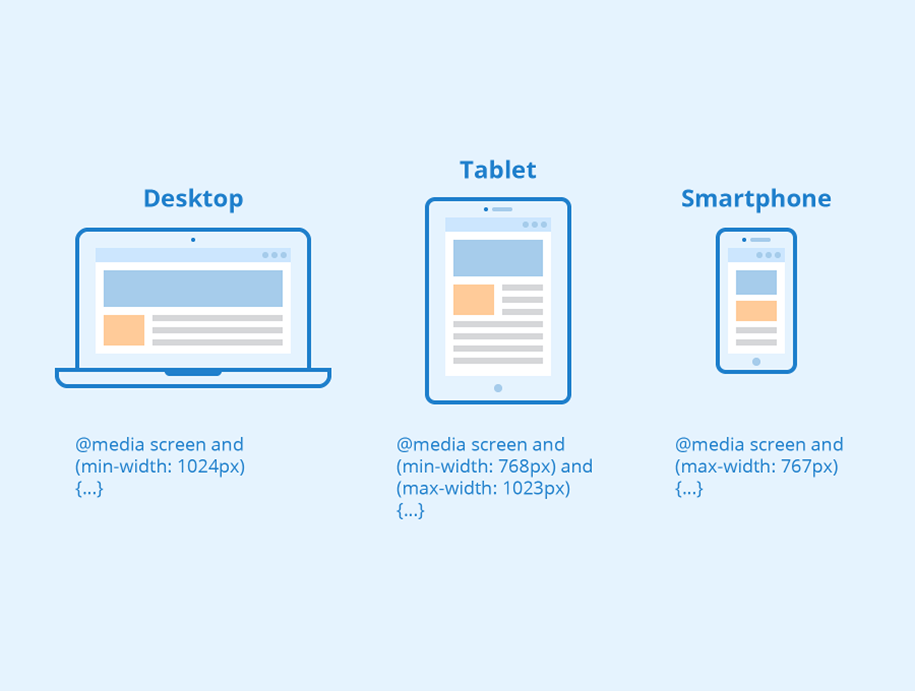
Responsive email design is an approach to email design that ensures emails look great on every device, regardless of the size of the screen it’s viewed on. Responsive emails should be optimized for desktops and tablets. For mobile viewing, they must offer a mobile-friendly user interface. It allows for emails to be tailored to fit the device it’s being viewed on, which is especially important in the age of mobile optimization.

Responsive email design is achieved by using HTML and CSS to create a single email template that can be adapted to any device. This helps to ensure that no matter the device the email is opened on, the content will look and function correctly.
Fluid email design is a key element of responsive email design. It allows percentage-based sizing for emails instead of pixels. This allows for emails to be optimally displayed on any device, regardless of the size of the device's screen. For example, an email that is 600px wide on a desktop computer may be resized to 300px wide on a mobile device, while still preserving its design elements. This is because the email is sized according to a percentage of the device's screen size, rather than a fixed pixel size. This allows for emails to be easily viewed on any device, resulting in a better user experience.
Additionally, responsive emails help improve user experience by providing an optimized experience for the device that the email is opened on, making it easier for users to interact with the email and take action. With responsive email design, brands can ensure their emails are seen and interacted with by their customers, regardless of the device they use.
Importance of Responsive Design in Email Marketing
Responsive emails help marketers reach their target audiences in the most effective way possible. From the initial design and layout of the email to the content, the presentation should be optimized to accommodate the device that the reader is using. This way, the user experience is improved and the message is more likely to be seen and understood.

Responsive emails also help marketers track open and click-through rates more easily, allowing them to better understand their audience’s behavior and adjust their campaigns accordingly. Furthermore, by making the email look great on any device, it will be more likely to be shared and spread to a wider audience. With more potential customers seeing the message, marketers can increase their reach and conversions.
Responsive email design has become increasingly important for brands who want to reach their customers no matter what device they use. Using HTML and CSS to create a single email template that can be adapted to any device helps to ensure that customers have a great user experience regardless of the device they use. Additionally, responsive emails make it easier for users to interact with the content, increasing the chances of them taking action. Responsive email design is an incredibly powerful tool for brands, as it helps to ensure their emails are seen and interacted with by their customers.
4 Reasons to make your Emails Responsive
Responsive emails are beneficial to any business that relies on email marketing campaigns. As mobile device usage continues to grow, it is imperative to ensure that your emails are optimized to be viewed on any device. Responsive emails enable your content to be displayed properly on any device, regardless of the screen size. Additionally, responsive emails can improve your SEO as Google has started to prioritize mobile-friendly websites in its search algorithm.
By having your emails optimized for various devices, search engines can recognize your content and rank it higher. Finally, having a responsive email also gives your subscribers a better user experience, as they can view your content on any device with ease. Applications such as Outlook are famous email platform with millions of users worldwide that offers numerous advantages to marketers. Configure the settings for messages sent and received via Outlook responsive email template. You can, for example, add a signature to communications you send or restrict message tracking.
Increased use of mobile devices
As the use of mobile devices continues to rise, companies must ensure that their emails are optimized for mobile devices as well. Responsive emails are designed to be displayed correctly on any device, regardless of the size of the screen. This means that emails must be designed to respond to the user’s device, adjust the content for the screen size, and even adjust the text size for maximum readability. Companies must also ensure that their emails are accessible for all users, meaning that all images must include alternate text for screen readers. By taking the time to ensure that their emails are optimized for mobile devices, companies can make sure that their emails reach their customers in the most effective way possible.
It creates a good user experience
Responsive email design is a great way to create an optimal user experience. It ensures that no matter what type of device the user is viewing the email on, the content is still presented in the best possible way. Responsive emails make sure that the user can easily navigate and read the content, as well as interact with any buttons or links that are included. Plus, it’s beneficial for SEO because it increases the chances of the email being seen by users on all devices. Responsive emails are also beneficial because they ensure that the message is consistent across all platforms, making it easier to track engagement and conversion rates. Overall, responsive emails are a great way to create an enjoyable user experience for readers of an SEO-focused blog post.
Reduce Email Unsubscribes
Responsive emails are the key to reducing email unsubscribes. By design, these emails respond to the device that the user is viewing them on. By utilizing this technology, marketers are able to ensure that their emails are presented in a way that is both aesthetically pleasing and user-friendly. By providing a better email experience for the user, marketers can reduce the number of unsubscribes and build a more engaged audience. Additionally, responsive emails can help to improve the overall SEO performance of the email, as search engines are more likely to rank emails that are optimized for mobile devices. In conclusion, responsive emails are an invaluable tool in reducing email unsubscribes and improving overall SEO performance.
Increase Click-Through Rate?
Responsive emails have been proven to have a positive effect on click-through rates. This is because they are designed to look great and be easy to use on any device, regardless of the size or orientation of the screen. This means that users are more likely to open and interact with the email, which leads to an increase in click-through rates. Additionally, with the rise of mobile devices, responsive emails are becoming more important because they make sure that your content looks great on any device. By optimizing your emails and making sure they are responsive, you can increase your click-through rate and get more out of your SEO efforts.
10 Tips for Creating Responsive Emails
When creating your responsive emails, keep in mind that the content matters just as much as the design. The content should be unique, high-quality, and relevant to both your audience and your product. In addition, try to include keywords in your subject line and body copy to help your email rank higher on search engine results pages. Incorporate visuals such as images, videos, or infographics to make your emails more engaging and interesting. Finally, be sure to include a call-to-action (CTA) button to encourage your readers to take the desired action. When creating CTAs, make sure they are clear, concise, and above the fold for optimal visibility and click-through rate.
1. Use a Responsive Email Template
Using a responsive email template is a great way to ensure that your emails look great on all devices. Responsive emails are designed to automatically adjust their layout and content to best fit the user's device, from smartphones to tablets to desktops. This means that the content will be formatted in a way that is easy to read and navigate on any device. Additionally, using a responsive email template can help to improve your search engine optimization (SEO) efforts. By having a consistent design across all devices, search engines can better crawl your emails and rank them higher in the results.
Responsive email templates also help to reduce user frustration, as they can quickly get the information they need, regardless of the device they are using.
Fluid grids provide a framework for responsive emails that allows them to adjust to different device sizes. The grid is divided into columns and rows, and email elements such as images, text, and buttons are placed into these grid cells. As the email is viewed on different devices, the grid will scale accordingly, reorganizing and resizing the elements to fit the device's screen size.
Flexible images are also used in responsive emails in order to create a seamless user experience. When images are displayed on a device, they will automatically scale to fit the screen size, ensuring that the user is able to view the image without any distortion. This allows the email to look clean and professional on any device.
Media queries are also an important component of responsive emails, as they allow content to be optimized to accommodate different devices and screen sizes. Media queries provide developers with the ability to target specific CSS rules to a certain device, allowing them to create emails that look great on any device.

Overall, the use of fluid grids and flexible images in responsive emails can offer a much-improved user experience for those viewing emails on their devices. By automatically resizing and reorganizing content, responsive emails can be quickly and easily viewed on any device, providing a more enjoyable experience for the reader. For digital marketers, this is certainly something that should be taken into consideration when crafting emails for their audience.
2. Optimize for Mobile Devices
When it comes to responsive emails, it is important to consider the mobile experience. Mobile devices now account for the majority of web traffic, so it is important to ensure that emails are optimized for mobile devices. This means that emails should be designed with a mobile-first approach and use high-resolution images, concise text, and clear calls-to-action.

Additionally, emails should be tested on a variety of mobile devices to ensure they look good and function properly across all devices. By optimizing emails for mobile devices, businesses can ensure that their messages are seen, read, and interacted with on any device.
3. Use a Single Column Layout
1. A single column simple layout is a great choice for responsive emails because it allows you to focus the reader’s attention on one area of the email.
2. Single column layouts are easy to read on mobile devices since all of the content is displayed in one column, eliminating the need for horizontal scrolling.
3. Single column emails are also great for SEO because they are quick to load and appear more visually appealing to the reader.
4. Single column emails are also easier to format for different screen sizes, making them a great choice for responsive email design.
5. Finally, single column layouts are also easier to update and maintain, making them a great choice for organizations that need to keep their emails up-to-date with the latest content.
Using a single column layout is the best choice for responsive emails. It helps ensure that readers have a consistent and easy-to-read experience on any device. Additionally, it also helps with search engine optimization (SEO) as it allows search engines to crawl and index the content more efficiently. With a single column, the content is easily scannable and all the pertinent information is visible to the reader. Furthermore, this layout works well with mobile devices and is a preferred choice for many email campaigns.
4. Keep the Design Simple
1. Don’t add too much visual or textual clutter to your emails. Keep your design simple and focused so your message is easy to read.
2. Stick to one font style and size to ensure readability.
3. Avoid large images or graphics that take up too much space and make the email difficult to read.
4. Use a simple color scheme to draw attention to the most important elements such as your CTA.
5. Make sure your call-to-action button is clearly visible and easy to click.
6. Break up large blocks of text into smaller sections to make it easier for readers to scan.
When it comes to designing a responsive email, it is important to keep the design simple. Too many elements can make the email difficult to read or take too long to load. Keeping the design simple will make it easier for email users to quickly scan the content and click through to your website. Additionally, a simple design makes it easier for the email to be formatted to fit any device, including mobile devices. Furthermore, a simple design is more likely to be seen as professional and trustworthy, which will help increase conversions. Lastly, a simple design is more likely to be optimized for search engine robots, which will help improve your email's ranking in the search results.
5. Use Large Font Sizes
Text formatting, Font-family, Font-weight, font size, and line-height are essential when crafting a responsive email. Not only do they make the email easier to read, but they also help to keep content concise.
1. Use large font sizes in your responsive emails to ensure that all of your content is easily readable on any device.
2. Increase the font size to 14 or 16 points to make sure that your text is legible on all mobile devices.
3. Test the font size of your emails on multiple platforms to make sure that it is visible and clear.
4. Consider increasing the font size of your CTA buttons to make sure that they stand out and grab the attention of your readers.
5. Make sure that your font size is consistent across all devices to ensure an easy and enjoyable reading experience.
Additionally, using larger fonts and fewer words can help to create a more aesthetically pleasing design. For search engine optimization (SEO) purposes, larger font sizes can help boost the visibility of relevant keywords, making it easier for search engines to crawl the content. Having clear and concise text with larger font sizes makes it easier for readers to quickly digest the information, increasing the chances of them engaging with the content and taking action.
6. Use High-Quality Images
When creating a blog post about responsive emails, it is important to include high-quality flexible images. Images that are optimized for SEO can help draw in readers and increase visibility in search engine rankings. Images should be properly sized and compressed to ensure they don’t slow down the loading time of the blog post.
1. Using high-quality images in your responsive email campaigns can help capture the attention of your target audience and encourage them to click through to your website.
2. Responsive emails that include sharp and clear visuals help create a feeling of professionalism and trust in your brand.
3. Incorporating email responsive images into your emails can help visually illustrate the key points, initiate communication, and make the content more engaging.
4. High-resolution images are essential for responsive emails as they help ensure the images are crisp and clear regardless of the device they are being viewed on.
5. Utilizing high-quality images can also help improve the overall loading time of your emails as they will be smaller in size and quicker to load.
Additionally, using images with relevant file names and alt text can further increase the SEO potential of the blog post. By following these best practices, a blog post about responsive emails can benefit from higher rankings and increased visibility.
7. Keep the Email Length Short
When it comes to responsive emails, keeping the email length short is key. Short emails are more likely to be read in their entirety, as readers don't have to scroll for too long. When crafting a responsive email, make sure to keep the text concise and the content to the point, avoiding unnecessary information.
1. Keep your emails to the point and avoid including unnecessary information.
2. Use bullet points or numbered lists to keep your emails concise and easy to read.
3. Break up long paragraphs into shorter paragraphs to make them easier to read.
4. Include a clear call to action at the end of the email.
5. Avoid using large images or videos as they can take longer to load.
6. Use language that is direct and to the point, avoiding flowery language.
7. Include links to relevant articles or resources to provide additional information.
8. Avoid using long sentences and overly complex words.
Additionally, ensure that the bullet points, headers, and other design elements are implemented to make the email even more scannable and easier to read. By doing so, you will ensure that your emails are both user-friendly and optimized for search engines, improving your chances of having them seen by your target audience.
8. Use Clear Call-to-Actions
When it comes to creating a successful blog post about responsive emails, it's essential to include a clear call-to-action at the end. This will help your readers easily understand the main point of the post and how they can take action.
1. "Sign up now to get our monthly newsletter delivered directly to your inbox!"
2. "Download our free eBook to learn more about responsive emails!"
3. "Schedule a free consultation with one of our email marketing experts today!"
4. "Subscribe to our blog to get the latest tips and tricks on responsive emails!"
5. "Follow us on Twitter to get instant updates on responsive email design!"
6. "Join our Facebook group to connect with other responsive email professionals!"
7. "Upgrade to our Pro version for more advanced responsive email features!"
A simple, yet effective call-to-action might be to encourage them to sign up for an email newsletter that is optimized for mobile devices. Or, they could be encouraged to explore various tools and resources that can help them to create and send out more effective responsive emails. Whatever the end goal of your post, make sure to clearly communicate it with your readers and provide them with a straightforward way to take action.
9. Test Before Sending
Once you have designed and programmed your responsive email, it’s important to test it before sending it. Testing can help you ensure that your email looks great on all devices and that all of the links and buttons are working properly. You should also test the subject line and email copy to make sure they are optimized for higher open rates.
1. Test the display of images across various email clients, such as Apple Mail, Outlook, and Gmail.
2. Check that all links are working correctly and are redirecting to the right web pages.
3. Verify that the email looks correct on both desktop and mobile devices.
4. Test the email with both HTML and text-only versions to make sure they display correctly.
5. Ensure the email subject line is displayed correctly and is not being truncated.
6. Test the email with a variety of email addresses to make sure that it is delivered successfully.
7. Check the email for any spelling and grammar errors.
It’s important to use a tool to test your emails on various email clients, such as Outlook, Gmail, and Yahoo. This will help you identify any issues that may arise when users open your email. Additionally, you should test your email on different devices and browsers to make sure the design looks great across platforms. With a little testing, you can make sure that your responsive email is optimized for the best possible performance.
10. Monitor Results and Make Improvements
After implementing your responsive email design and sending it out to your intended audience, you should monitor the results and make improvements if necessary. Analyze the open and click-through rates of your email and adjust your design accordingly.
1. Monitor the open and click-through rates of your emails to determine which types of messages are most successful.
2. Experiment with different types of calls to action to see which ones are most effective at driving additional engagement.
3. Track the performance of your emails across different devices and email clients to ensure your messages are being properly displayed.
4. Test different subject lines to see which ones have the highest open rates and engagement.
5. Analyze the bounce rate of your emails to identify any technical issues that may be preventing users from receiving them.
A/B testing is also a great way to test the effectiveness of your design. Try sending out different versions of the same email to different segments of your audience and compare the results. Pay attention to the parts of your design that are working and the parts that are not and make changes to optimize the performance of your emails.
Conclusion
Businesses that are looking to create responsive emails face a few different challenges. Firstly, responsive emails must be designed for all types of devices, from desktop to mobile, and this can be difficult to achieve. Additionally, responsive emails must be optimized for search engine optimization (SEO). Companies must ensure that the code of the email is optimized for SEO, and that the content of the email is structured in a way to be picked up by search engine crawlers. S2W Media's email marketing capabilities create an effective and efficient way to reach potential customers and leads. The ability to customize content and tailor messages to specific audiences, as well as track user data and analyze results, allows for more targeted and successful campaigns.
Furthermore, the ability to integrate with other digital marketing strategies, such as SEO, ensures that the messages are reaching the right people and increasing the chances of conversion. By utilizing S2W Media's email marketing capabilities, businesses can easily create engaging and SEO-focused emails that will help generate more leads for client events and convert leads to actual sales.

_MI-Jul-21-2025-12-12-31-9950-PM.png?width=390&height=195&name=6419cb7e400c4b27e1af65a0_MicrosoftTeams-image%20(132)_MI-Jul-21-2025-12-12-31-9950-PM.png)

